Case study · FinTech · Product Design · Design Systems

Converj

Redesigning a fintech product end to end - from a fragmented core experience to a coherent product with OCR-powered invoice processing, payment flows, and a cross-platform design system that scaled the team's velocity.

Role

Lead Product Designer

Company

Converj - B2B FinTech

Timeline

Jul 2023 - Feb 2025 · 1 yr 8 mos

Scope

Full product redesign · OCR flows · Payment UX · Design system · Web + Mobile

Converj
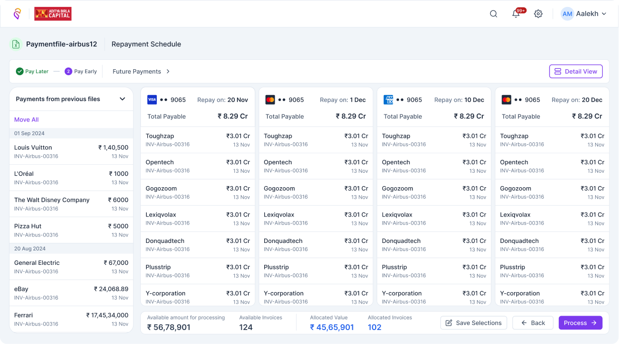
Converj automated pricing dashboard

A product that worked technically but failed commercially

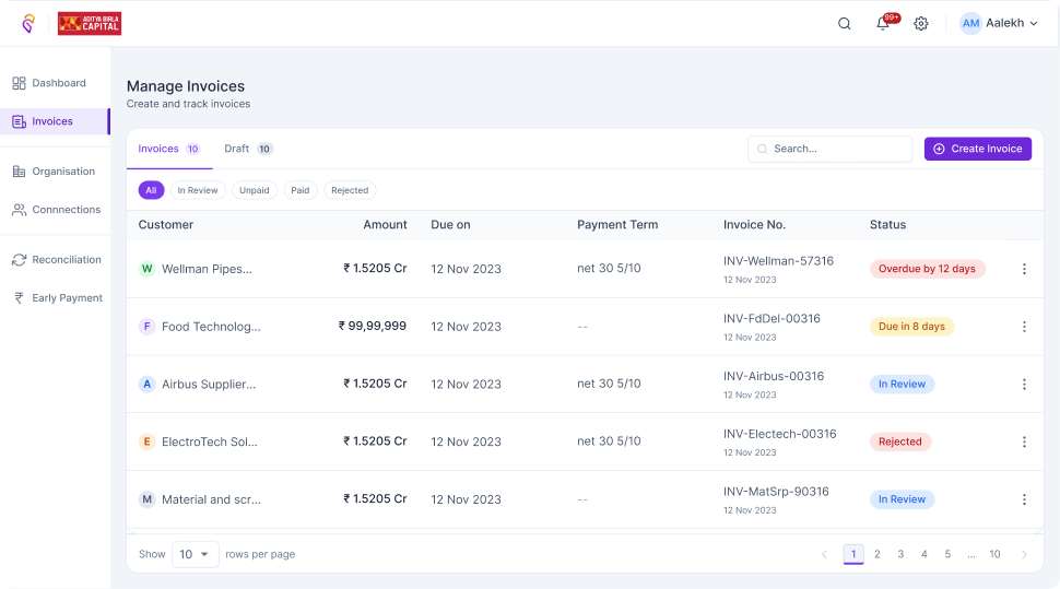
Converj was a B2B fintech platform for invoice management and payment processing, targeting small and mid-size businesses in India. The engineering team had built a functional product - invoices could be created, vendors could be managed, payments could be initiated. But the product was haemorrhaging users after signup.

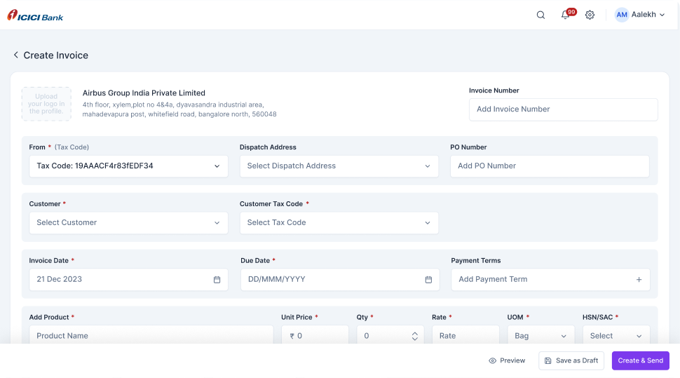
The core issues were threefold. First, the onboarding and invoice creation flow required too many manual inputs - businesses were spending 15–20 minutes creating a single invoice that should have taken two. Second, the product had been built feature-by-feature without a coherent information architecture, making navigation confusing and feature discovery poor. Third, there was no design system - every new feature looked slightly different, eroding the sense of a unified, trustworthy product. In fintech, trust is the product.

The founding team brought me in to rebuild the product experience from the ground up - not a cosmetic refresh, but a fundamental rethinking of the core flows with a design system as the foundation.

~70%
Reduction in invoice creation time via OCR
1→2
Platforms covered by a single design system
Full
Product surface redesigned end to end

Understanding why users were dropping off

Before touching Figma, I spent two weeks in discovery: user interviews with existing customers, session recordings, and a structured audit of the existing product against competitor experiences. The goal was to separate the symptoms (drop-off, complaints) from the causes (specific friction points and mental model mismatches).

The most important finding was about invoice creation. Most users were receiving invoices from vendors - PDFs or scanned images - and manually re-typing every field into the product. This wasn't a UX preference issue; it was a workflow mismatch. The product assumed users would create invoices from scratch, but the majority use case was ingesting invoices that already existed elsewhere.

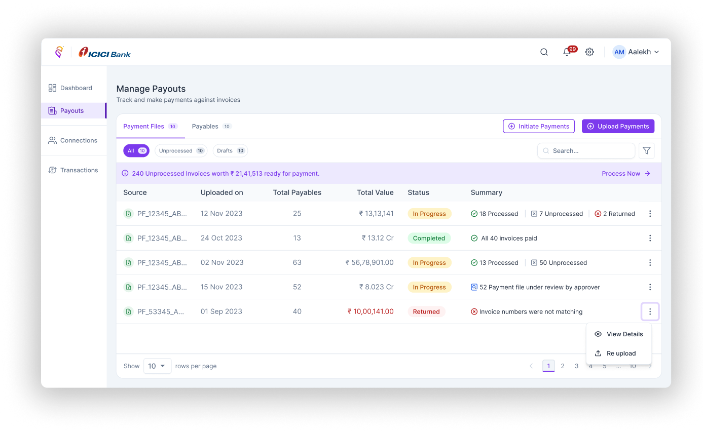
A second key finding: users didn't trust the payment initiation flow. The confirmation screens were ambiguous, the error states were unhelpful, and the status tracking post-payment was absent. In financial products, uncertainty at the payment step is a product-killer.

Three bets, one foundation

I worked with the founding team to define three strategic priorities, ranked by impact-to-effort ratio. First: OCR-powered invoice ingestion - this directly addressed the highest-friction workflow and had a clear technical path. Second: payment flow redesign - rebuilding the confirmation, status, and error experience to establish trust. Third: design system foundation - not a deliverable for its own sake, but the infrastructure that would make all future work faster and more consistent.

I recommended starting the design system alongside the OCR flow, not after it. This added some upfront work but meant every component we built for the OCR flow would immediately become a reusable asset. By the time we reached the payment redesign, the form components, button states, status indicators, and feedback patterns were already production-ready.

How I approached the redesign

01

Information architecture rebuild

Ran card-sorting sessions with six active users to map their mental models of invoice and payment management. The existing navigation grouped features by technical category (invoices, payments, vendors) but users thought in terms of tasks (what do I need to do today?). Rebuilt the IA around task frequency and decision flow, not feature type.

02

OCR invoice flow design

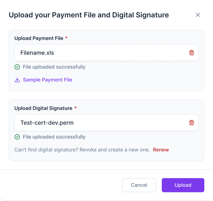
Designed the end-to-end OCR ingestion flow: drag-and-drop upload, real-time field extraction with visual confidence indicators, editable extracted fields with inline validation, and a one-click confirmation screen. The key design challenge was communicating extraction confidence without alarming users about potential errors - I used a progressive disclosure model where low-confidence fields were surfaced for review first.

03

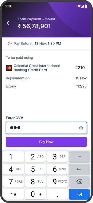
Payment flow redesign

Rebuilt the payment initiation and confirmation experience from scratch. Key changes: a clear, step-indicated flow (select → confirm → authorise → done), explicit confirmation screens showing exactly what will be debited and when, meaningful post-payment status tracking, and actionable error states that told users what went wrong and what to do next.

04

Cross-platform design system

Built the design system in Figma with a token-first approach - colour, typography, spacing, and radius defined as tokens before any component was built. Created a core component library covering forms, tables, data cards, status indicators, and feedback patterns, all with documented variants, states, and usage guidelines. The system covered web and mobile (iOS and Android) from day one.

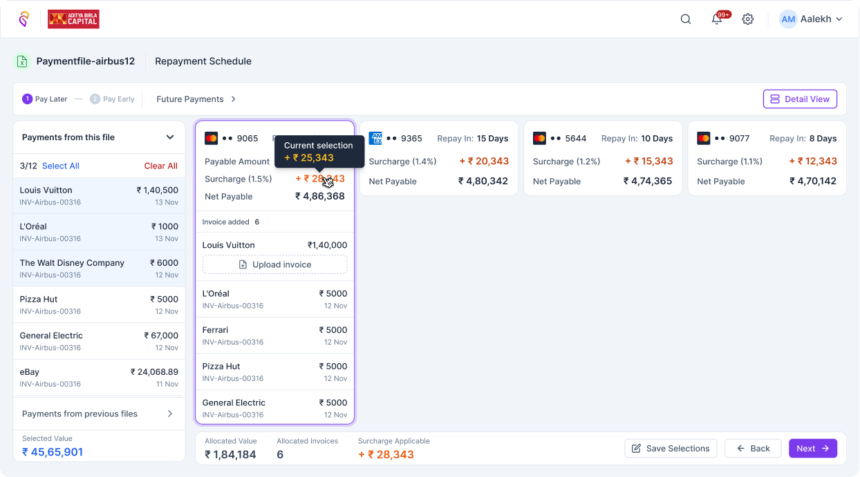
Product screens · converj.com

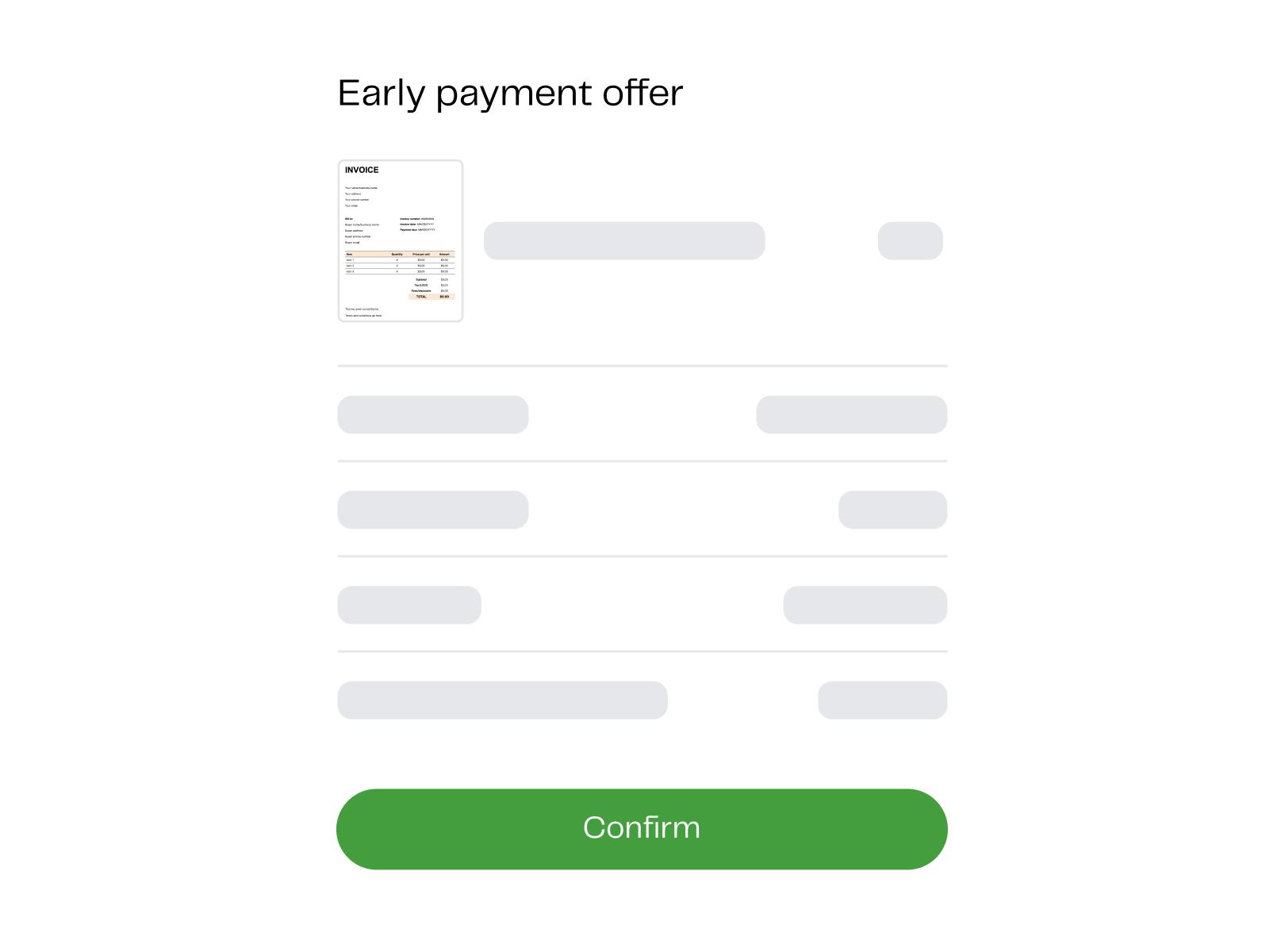
Converj automated pricing
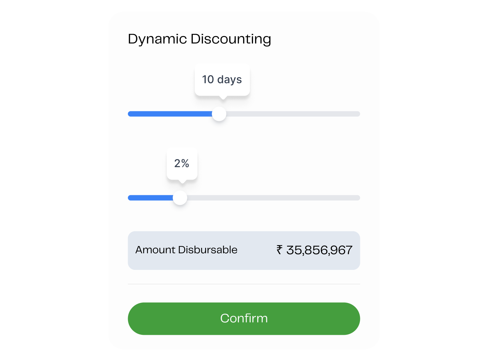
Converj dynamic discounting
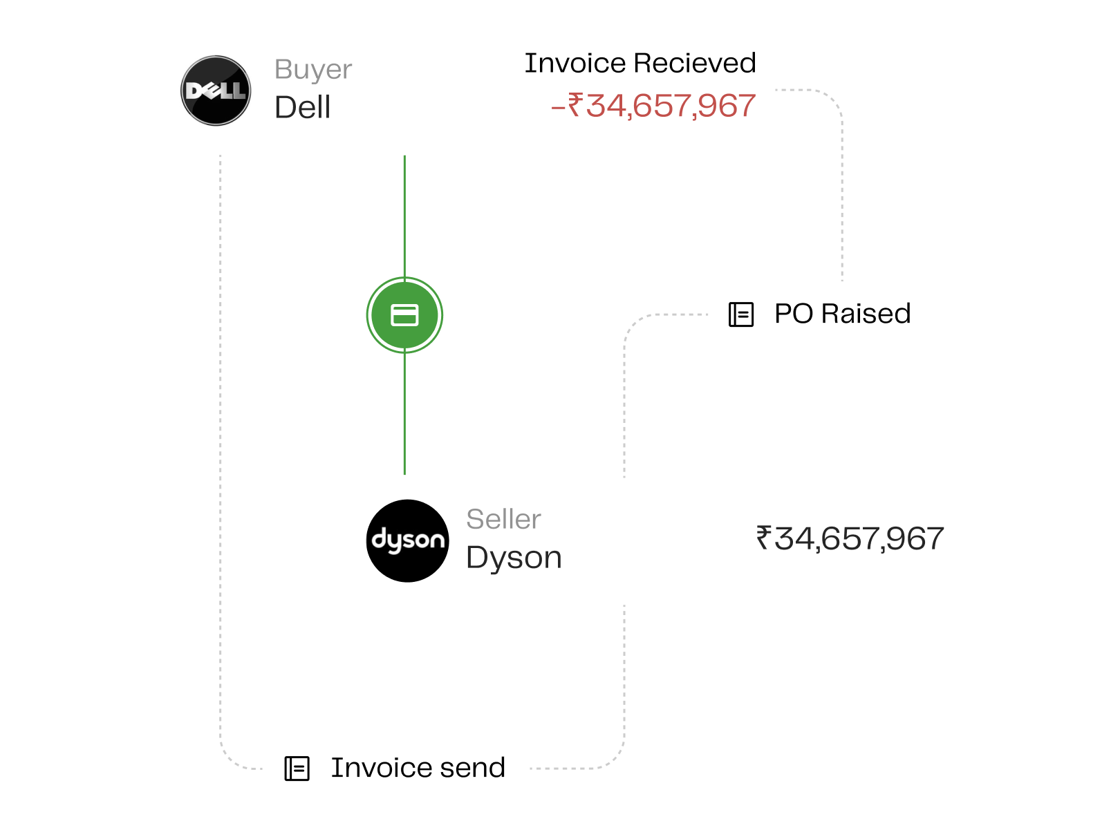
Converj P2P comprehensive
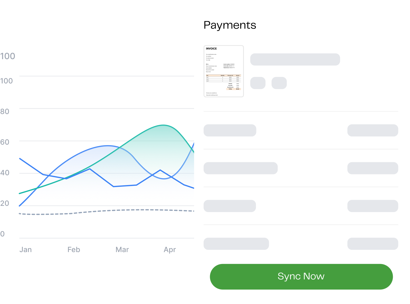
Converj advanced analytics
Invoice OCR
Upload a PDF or image - we'll extract the fields automatically
Drag & drop invoice here
PDF, JPG, PNG up to 10MB
Browse files
TechFlow_Invoice_2241.pdf
Extracted · 8 fields · 2 need review
Extracted fields
Review and confirm before saving
Vendor name
Techflow Supplies Pvt. Ltd.
Invoice number
INV-2241
Invoice date
12 June 2023
Total amount
₹48,500.00
Due date Review
26 Jun 2023
GST number Review
27AAACT3518Q1Z5
Confirm & Save Invoice →

Building the design system as product infrastructure

The design system wasn't a side project - it was the foundation that made everything else possible. I started with tokens: a semantic colour system (primary, success, warning, error, neutral - each with 10 shades), a typographic scale anchored to Inter, and a spacing system on a 4px base grid. Every component was built on top of these tokens, not hardcoded values.

The component library covered the core surfaces of a fintech product: data tables with sortable columns and bulk actions, form components with full validation state coverage, status badges and timeline indicators, invoice cards, payment confirmation modals, and feedback patterns (toasts, empty states, error screens). Every component had documented variants, usage guidance, and do/don't examples.

Crucially, the system was designed for web and mobile from the start. Rather than building web first and adapting for mobile later, I defined mobile-first touch targets, spacing, and interaction patterns at the token level - meaning iOS and Android implementations could share the same design logic with only platform-specific adaptations.

The practical outcome: the engineering team stopped asking design questions about edge cases, error states, and component variants - because those answers were documented in the system. Design QA rounds decreased, and new features were built more consistently.

Beyond the design role

At a small fintech startup, the design role extended well beyond Figma. I joined product roadmap sessions with the founding team, contributed to feature prioritisation decisions, and was involved in early conversations about pricing model UX and onboarding flow design. When engineering raised implementation constraints, I was at the table to make real-time tradeoff decisions rather than being informed of them after the fact.

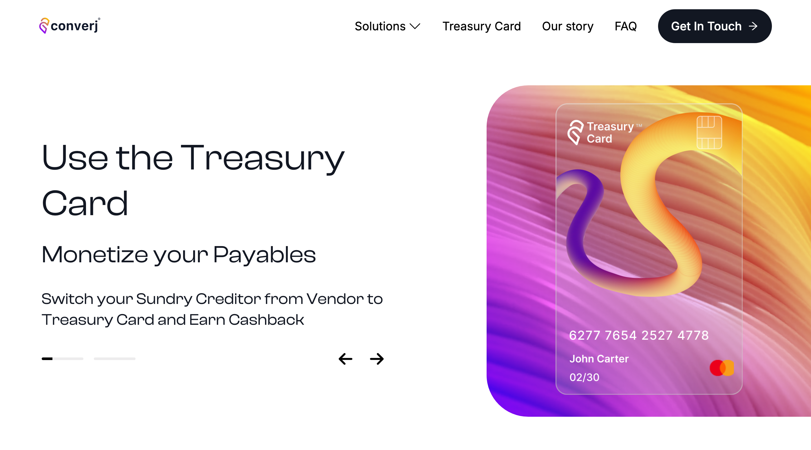
I also redesigned the company's main website to align with the product's refreshed visual language - ensuring that the experience a user had before signing up matched the experience inside the product. This consistency is often underestimated in B2B fintech, where first impressions directly influence purchase decisions.

What changed

The OCR invoice ingestion flow reduced invoice creation time by approximately 70% for the most common use case - ingesting an existing vendor invoice - by eliminating manual data entry for eight standard fields. Users who had previously abandoned the creation flow began completing it.

The payment flow redesign addressed the trust gap. Explicit confirmation screens, real-time status tracking, and actionable error messages removed the ambiguity that had caused users to hesitate or abandon payment initiations.

The design system gave the engineering team a shared vocabulary and a self-serve reference for implementation decisions - reducing design QA meetings and increasing the consistency of shipped features. The system covered both web and mobile from launch, eliminating the typical platform divergence that accumulates into design debt over time.

What this project taught me

Fintech design is trust design. Every ambiguous label, every unclear confirmation, every missing status indicator is a moment where users lose confidence in a product handling their money. The design bar for clarity and feedback in financial interfaces is higher than in most other product categories - and it should be.

The OCR flow was also a lesson in designing around AI capability rather than around AI perfection. The system wasn't going to extract every field correctly every time. The design challenge was making it safe to be wrong - surfacing low-confidence fields for human review, making corrections easy, and never hiding errors. Trust in AI features is built through transparency, not through hiding failures.

Building the design system first felt like overhead at the time. Six months later, it was clearly the right call. Every feature that shipped after the system was in place shipped faster and with more consistency. The upfront investment compounded in exactly the way a systems investment should.